< 1 Min Read
How Coronavirus Visuals and Story Help Explain a Crisis
There’s no shortage of coverage around the unfolding coronavirus pandemic. Reports of infection rates and epidemiological projections have flooded websites and social media since the first cases were reported in China last year.
Yet it wasn’t those statistics and data that finally brought the epidemic into focus for millions of at-risk Americans.
It was Tom Hanks.
When Hanks announced he and his wife had contracted coronavirus in Australia, it demonstrated that no one — not even Sheriff Woody — was immune. When the NBA suspended its season amid coronavirus fears, it had a similar effect. Suddenly, the virus was not an abstract, faraway threat. It was real, and it was impacting life here in the US.
Coronavirus Communications and ‘Flattening the Curve’
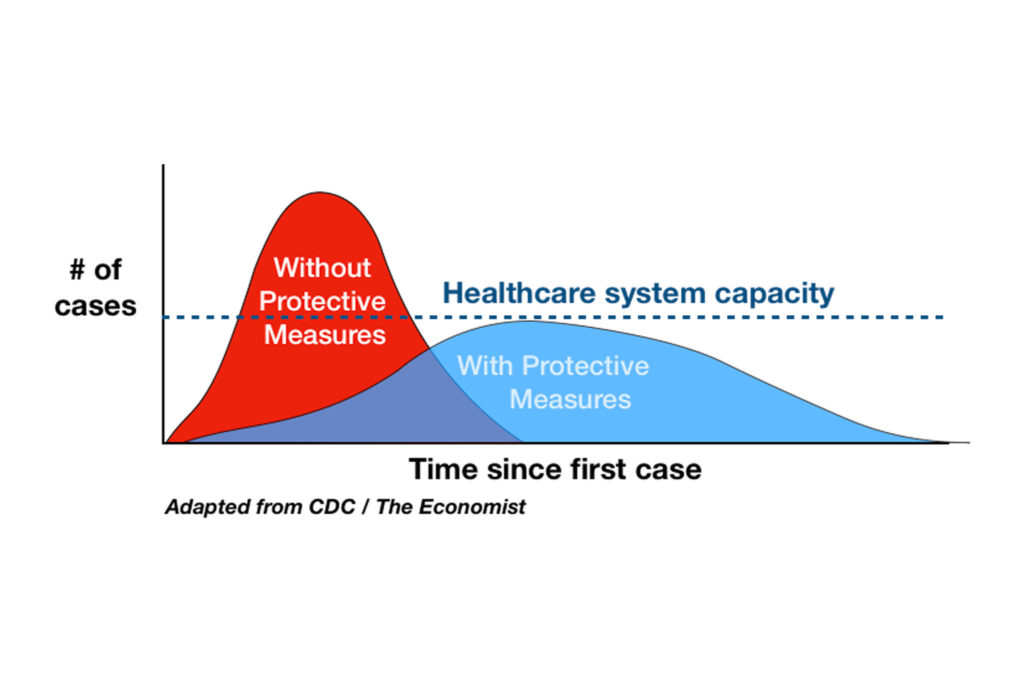
There’s another communications element worth highlighting amid the coronavirus coverage — the “flattening the curve” graphic.

The chart doesn’t include any statistics or complex epidemiological data. With just two bumps and a dotted line, it shows the importance of slowing the spread of the virus.
That simple graphic, combined with the incredible amplifying power of social media, quickly shared the idea that preventive measures like social distancing and handwashing were critical for everyone, not just those exposed. Scientists credit the graphic with saving lives.
The Power of Effective Communications in Crisis
Changing the public’s behavior in times of crisis is notoriously challenging. People have a hard time accurately estimating risk in their own lives. It’s a compelling lesson in the power of effective communications. When done right, it can have a tremendous impact.