< 1 Min Read
Olympics Embrace a More-is-More Look
The Olympic Games not only push the limits of athletic prowess but also in design.
Since the early 20th century, artists have been commissioned to create posters that promote the Olympic Games as a major sporting and cultural event. These posters capture the “Olympic moment” and reflect the universality of sport through their designs.
Traditionally, they feature the iconic Olympic rings and symbols or abstract designs representing athletes or the host city.
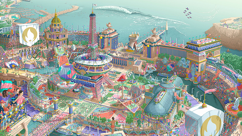
This year’s poster for the Paris 2024 Olympic Games adds a unique twist to that tradition.
While every Olympic poster is distinct and reflects the design trends of its era, the 2024 poster stands out by breaking away from the clean, modern aesthetics that have come to define the digital age.

Design to the Max
What makes this year’s poster different? In a word: maximalism. This design trend embraces abundance, with intricate detail, colors, and layers that evoke a sense of “extra.”
The poster is actually a set that includes two complementary designs for the Olympic and Paralympic Games, both packed with symbols of Paris. From iconic venues to elements representing the city and France, every hand-drawn square inch is filled with Easter eggs waiting to be discovered.
The poster’s creator, illustrator and graphic designer Ugo Gattoni, grew up in the “Where’s Waldo” era. According to his website, it took him over 2,000 hours to create the posters. His design also calls on the classic Paris art deco style with a lush color palette.
Maximalism has potential for rich detail and storytelling. The feeling of busyness and chaos counterintuitively invites us to slow down and explore the details. This brings a welcome contrast to the fast-paced social media and digital space, where audiences are craving something different from the streamlined visuals they’ve grown used to.