
2 Min Read
Dueling NASA Logos
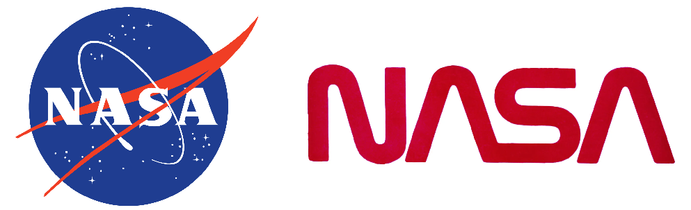
The “meatball” is 65 years old this year.
NASA’s first and arguably most recognizable logo dates back to the agency’s founding in the late ‘50s. Today, it’s one of two visual marks that encapsulate NASA’s look and feel.
Like all good logos, the original NASA “meatball” mark served a key messaging purpose for the new agency.
Pre-NASA, the National Advisory Committee on Aeronautics (NACA) was tasked with coordinating aeronautics research across government agencies. Then, its scope expanded significantly to include all of outer space, and NASA was born.
The evolution from NACA to NASA was achieved in part thanks to the new logo. Here’s how NASA describes it:
“In the design, the sphere represents a planet, the stars represent space, the red chevron is a wing representing aeronautics (the latest design in hypersonic wings at the time the logo was developed), and then there is an orbiting spacecraft going around the wing.”
Galactic Graphics
But reproducing and printing the meatball was a challenge. In 1975, NASA decided it needed a more modern logo, and the “worm” was born. The worm is more straightforward – just the word “NASA” in a connected type style.
The modern look in the ‘70s is decidedly retro now, which aligns the logo with today’s throwback design trends.
Once again, the logo served a strategic purpose. It was intended to reignite public excitement around NASA after the Apollo missions concluded. It also aimed to connect the disparate NASA centers and laboratories.
The update entailed far more than a new logo. The agency detailed all the changes in the NASA Graphics Standards Manual, a comprehensive style guide which design aficionados still revere to this day.
NASA retired the worm in favor of the meatball in the early ‘90s, only to reinstate it a few years ago as a way to “mark the return of human spaceflight on American rockets from American soil.”